Client: BranCon
Services:
- Logo and Branding
- Offset printing
- Graphic design
- Web design
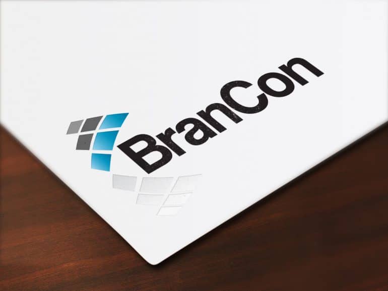
BranCon wanted an elegant and distinctive logo design for their re-branding. Their previous logo was red and they felt it was quite aggressive, so wanted to go with more soothing blues for this one. Being a construction company we thought the ‘building blocks’ were a good concept and positioned them in a forward arrow to convey a sense of forward thinking in their company.
Interested in knowing more?
[ninja_form id=”1″]
Client: BranCon Services: Logo and Branding Offset printing Graphic design Web design BranCon wanted an elegant and distinctive logo design for their re-branding. Their previous logo was red and they felt it was quite aggressive, so wanted to go with more soothing blues for this one. Being a construction company we thought the 'building blocks' [...]


